Colour and music have a lot in common. Both can provoke emotions, and both work on a vibrational level. In some ways therefore, colour is music for the eyes.
Like music, which we can only hear within a certain range of frequencies, colour can only be seen within a limited spectrum. Colour is essentially electro-magnetic energy that allows us to see, and experience, the colours red, yellow, orange, yellow, green, blue and violet, and the more than 10-million hues, shades and tones that derive from mixing those.
There are thoughts that because the human eye is only capable of seeing three colours – red, green and blue - and the merging of those that create other colours, that there may be a whole spectrum of new colours that are beyond our current visual capabilities. Comprehending that concept is made easier by the discovery of infrared and ultraviolet, which exist beyond the visible colour spectrum and that require interventions for them to be visible. However it is believed that bees can see ultraviolet, and snakes, infrared.
Vibrational energy impacts
Even if influenced by trends, when we use colour we are actually being impacted on by associated vibrational energies. Those energies can be subtle or strong, too little or too much, and whether you realise it or not, the use of colour in your surroundings has a direct effect on your behavior.
Case studies
A boy of 12 years, diagnosed with Attention Deficit Hyperactivity Disorder (ADHD), over a six-month period, had become exceedingly more aggressive and was easily frustrated. This coincided with his support and passion for football club Manchester United whose team colour red via branded soft furnishings, dominated his bedroom. Red is an exceptionally strong colour, which when over-used can frustrate and provoke anger. Simply changing the curtains and pillowcases from red to the calming softer tone of cream reduced a red over-stimulation by 50 percent and the young boy’s aggressive behaviour diminished significantly.
A recently widowed woman of 77 years would weep uncontrollably when entering the bedroom. This room, decorated in varying tones of blue, was the one in which she and her husband had shared more hours together than any other space in the house. While the colour blue is ideal for bedrooms because of its calming effect, its over-use can be depressing. The introduction of peach to replace many of the soft furnishings improved the widow’s depression and allowed her to feel more able to cope with her loss.
Selecting colours
Stages in our lives, events and even health can be improved through the use of colour. Colour therapists recommend that when choosing colours for a home it is far better to make decisions based on the emotion a colour produces rather than applying logic or standard formula’s, such as those that suggest partnering opposing colours. When the choice of a colour may appear inappropriate or too overwhelming, for example on walls, using it as highlights and in soft furnishings can still create a sense that it is the dominant colour.
Homes, like colour, also have energy vibrations, which have largely been stimulated by their occupants. Such energies project as ‘atmosphere’. In extreme cases you may feel reluctant to enter a home or progress with a home viewing simply because you ‘feel’ uncomfortable. In such circumstances it is not unusual for agents to encourage home owners to repaint, particularly dark rooms, to encourage a sense of lightness and allow viewers to easily envisage their furniture in a space.
The darker a colour and more dominant, the more likely it is to absorb light, and thereby makes a room look smaller in the same way that the lighter the colour in a room, the larger it tends to feel. When decorating if you have a need for a dark wall colour, no matter what the size of the space, painting just a single wall will satisfy your need for that colour without it over-stimulating your mood or energy.
Read more: How to brighten a dark room
Here are some basic emotions and energies stimulated by the visible spectrum colours.
Red
A colour of revitalisation. It provokes, demands attention, lifts the spirit, increases energy, and helps us become braver, feel more powerful, feeds passion, and urges action. It is the colour of fast cars, power and courage. It warns of danger, can over-excite and provokes insomnia, restlessness and agitation. Red also increases appetite.
Rooms: Home gyms and kitchens. Only in the bedroom if intimacy, coziness and warmth is required.
Orange
A colour of health and happiness, it introduces excitement and fun, and stimulates humour. Orange is a colour of unity, bonding and interaction. Like red, it also stimulates appetite, and can open up creativity, liberation and release us from inhibitions.
Rooms: Study, patio’s and braai areas, kitchens, and dining rooms.
Yellow
With all of the warmth of sunshine, yellow promotes optimism, joy, giving and serving. It encourages mental energy, adventure and reduces egotism. It has the ability to promote attention to detail and studiousness as well as the absorption of information. Over use of yellow may make it difficult to switch off and relax.
Rooms: Studies, libraries, sunrooms and lounge/sitting areas.
Green (and Pink)
These are the colours of love, relaxation, gentleness and sharing. Green especially refreshes, gives balance and promotes generosity. It brings serenity and growth, and creates a sense of abundance. Pink nurtures and amplifies affection, is calming and projects good health and comfort. Over used, pink can increase immaturity and unreasonable emotional outbursts.
Rooms: Bathrooms, bedrooms, lounges and patio’s, also home offices.
Blue
Peace, calm, sensitivity and trust are manifested from the use of blue. It is restorative and infinitely gentle. Integrity is stimulated, the chattering mind is calmed, and emotions and temperatures are cooled. It can however be depressive and induce moodiness but its slow, sleepy characteristics tend to allow honest and free-flowing communication.
Rooms: Bedrooms, bathrooms, kitchens.
Violet
A colour of mystery, violet has long been the colour most used by royalty, philosophers, magicians and religion. It provides a sense of ambition, of authority, growth and loyalty. It has been said that we all have a ‘purple’ stage in our lives, a projection of either wanting or having acquired a sense of purpose. Violet helps us to innovate and raises our level of awareness.
Rooms: Dining rooms, playrooms, children’s bedrooms and lounges.
Black and white
See more: The art of minimalist living
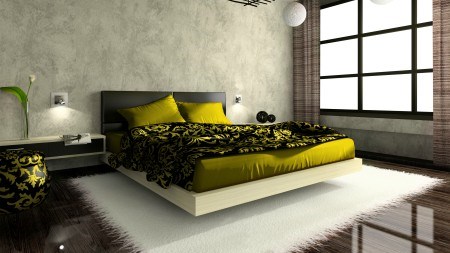
These two are not colours per se; black is the absence of all colour, white the presence of all colour. However they do promote effects that impact mood. Black presents as a closed, almost emotional, barrier; conversely white as an open and receptive channel. Both protect however and stimulate self-control. They are opposite in terms of producing emotions and reactions. As black represents night and white the light of day, so too is black more depressing than white. Black hides while white highlights, but when used together they tend to create a sense of chic, glamour and style, and of magic.
Rooms: All rooms benefit from black and white in terms of their ability to mix well with all colours, white more so than black. The use of ‘solely’ white may be uplifting, but ‘solely’ black can be exceedingly depressing and sinister.


