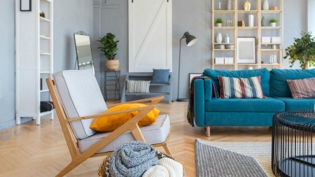
For those décor lovers who missed it, Classic Blue was named Pantone Colour of the Year for 2020. Known for instilling a sense of reassurance and dependability, it’s a colour we could certainly do with a little more of.
According to the Pantone team, Classic Blue speaks to our human desire for consistency and stability. Given all that we as a nation and global community are enduring due to the outbreak of the COVID-19 virus, it’s not hard to see why this versatile shade could become even more popular than predicted. So, how do our décor experts recommend incorporating Classic Blue into a home? Well, there are quite a few options to work with but here are a few to get you thinking:
- DON’T JUST PAINT THE WALLS
Often when we’re into home DIY and catch wind of a new colour trend, we automatically rush out, buy a roller and get that shade onto a feature wall as quickly as possible! Décor experts, however, encourage against settling for a feature wall on its own as a way of bringing in a new colour like Classic Blue. Instead, they encourage you to get creative and generous with your paintbrush and paint more than just the wall – for example; why not include the floor trim, ceiling, any wall shelves as well as the window frames and sills as this helps create a cohesive feel and eliminates any other décor elements competing for the eye.
- GET FLOORED
If you find that Classic Blue is a colour that does speak to you and you’re keen for a more permanent way of incorporating it into your home, why not be bold and consider upgrading your flooring to something in this shade? Whether it’s Classic Blue tiles in the bathroom or Classic Blue screed in the kitchen, never forget that your flooring can make just as much of a statement as a feature wall can. That said, if redoing the floor is a step too far for you, a less permanent way of bringing in this colour is with a statement rug. This way if you grow tired of Classic Blue sooner that you thought, finding a rug in a new shade is a relatively easy task to manage.
- PAIR IT UP WITH A BIT OF NATURE
Let’s face it. There’s very little that doesn’t go well when paired with the lush greenery of nature! Classic Blue is no exception, and in fact, has a definite harmonious relationship with the plant world thanks to its natural undertones that link back to the colour of the sea and sky. You can therefore confidently look at bringing in Classic Blue via planters, pot plants, or even by adding a few hanging plants in front of that feature wall should you choose to go that route.
- TAKE IT OUTSIDE
For the reasons mentioned above, Classic Blue makes for a fantastic backdrop when you have a lush garden! With this in mind, there are many ways of incorporating it outside your home as well as inside! For example; depending on the style of your home, adding a pop of Classic Blue by painting your front door could be a bold choice, especially if you have a face brick home. Similarly, painting your gate or garage door could also be an adventurous option to try! You could also consider making the ultimate statement and painting the outside of your home this shade as experts note that while the notion may seem extreme, the result is definitely eye-catching in the best way.
- LET IT SHINE
If you’re not up for making a big décor commitment at this time, fear not! You can still cash in on all the benefits of Classic Blue without the commitment and without breaking the bank! Rather, look to benefit from this colour’s adaptability across different materials, palettes, textures, and finishes by incorporating it as a feature piece or décor accent in any room. For example:
- Make a Classic Blue statement with a striking corner couch or bathroom vanity in this shade.
- If furniture pieces don’t do it for you, opt for an area rug, especially in an open-plan space as Classic Blue is a colour also known for helping pull everything together from a visual point of view.
With all the change and uncertainty facing us as South Africans, we’re going to need to look for new and perhaps unexpected ways to remind ourselves that we will endure whatever comes our way next. As a start, incorporating Classic Blue into your home décor could serve as one such reminder by helping create a sense of peace, confidence, and resilience whenever you walk through your front door. Given the future we’re facing, a little of that Classic Blue magic could very well give our mental wellbeing a little boost – and at a time like this, we could certainly all use a little pick-me-up no matter the shape, or in this instance, the shade.


