Whether or not anything is "classic" is a personal choice. While what one person views as classic may be considered contemporary by another, some locations emanate a timeless elegance that compels us to refer to them as a classic.
Elegant designs and sophisticated colour schemes are carefully combined with ancient features to create environments that never feel stale or boring. Most of the time, it's a quality "we know it, when we see it," which makes it difficult to invent from scratch.
How to start?
How about starting from the beginning? A traditional colour scheme with timeless appeal. With the timeless colour combinations below, some of our favourite interior designers have guided us in the right direction—from classic neutrals to rich jewel shades that never go out of style. Be sure to seek the services of a custom home builder to guarantee the perfect results. These designer-approved colour schemes can help you achieve a classic look, whether you're painting a historic home or building a new one.
Please continue reading to see our options for a classic colour scheme, as recommended by the pros.
Choose deep jewel shades.
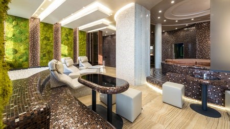
When it comes to colour trends, dark and stormy are still at the top. The elegant definition can be added to a space by utilizing this technique on the stairway, feature windows, or woodwork. Try a plum or black with a red undertone for a warmer, more dramatic look if you're tired of dark charcoal greys and blue blacks. When used with pinks and nude tones, it gives a touch of cosiness to chilly palettes.
Pink and green trend-mix
Pink and forest green are an odd colour combination that can be seen all over right now, including on walls, homeware, and even in daring kitchens. When two colours sit opposite each other on the classic colour wheel, they are complementary because they enhance one another and aren't as starkly different as green and red are. Consider these colours for your custom kitchen remodel.
Add a touch of electric blue.
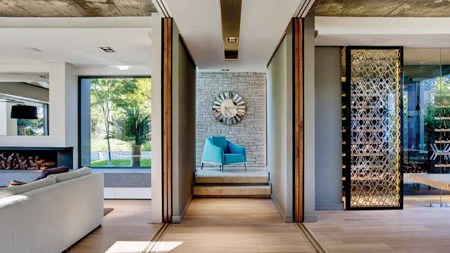
Blue has always been a classic colour, so it's no surprise that it's currently popular. Although dark blues, navy blues, and blue/blacks have become commonplace, the lighter blues of the spectrum will make a comeback in 2021. Even in little doses, brilliant blues like sky and cobalt inject life and vibrancy into a space.
To keep up with the current colour trend, paint your woodwork or shutters a bold blue. Although it will be just as powerful as if you put it on the walls, it's much more liveable.
Replace cool greys with neutral stone hues
'The neutral trend for 2021 continues gently away from frigid greys and conventional creams, towards warmer neutral stone tones.' According to Little Greene's Creative Director, Ruth Mottershead, this year's theme is all about creating cosy cocoon environments that feel comfortable and private.
An increasingly fashionable alternative to cooler colours is "earthy" "stonier" tones combined with soft, welcoming greens. 'These soft neutrals bring warmth to any room in the house while providing a stylish, complimentary canvas for fabrics, wallcoverings, and furniture of all kinds.'
Bring back red
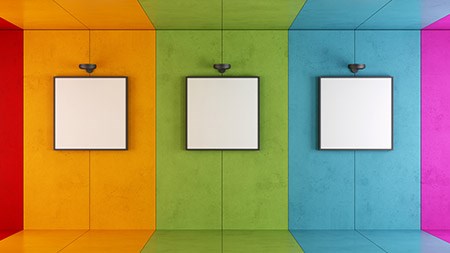
The colour red, of course. Another example of how the colour trends for 2021 aren't about following rules is the return of this striking and famously tough decorating with shade. Dark terracotta or dark pinks are good alternatives if you're worried about using primary colours in your home. However, the more vibrant the colour, the more joyous and optimistic it can make you feel.
Be inspired by nature.
The year 2020 was a major one for going back to nature; the rural idyll was more appealing than ever before, and that allure swiftly spread to how we decorated our homes, even in the city. We'll continue to draw inspiration from nature, with green serving as a major colour trend.
Whether it's olive, emerald, or sage green, these shades are all the rage right now, and it's simple to see why. For a serene atmosphere, combine it with soothing natural textures and wooden accents.
Conclusion
The colour palette you choose for your living room sets the mood. Use a colour scheme that you adore to make the space feel warm and inviting. These living room colour ideas can be adapted to fit your decorating style.
Writer : Rian Harrolton


