Although sometimes overlooked, colour plays an important role in our daily lives. It guides us, attracts us, warns us and energises us. As 2015 marches on, it’s well worth delving back into the year’s colour forecasts.
Commenting on the matter of colour at the beginning of 2015, Plascon’s Colour Manager Anne Roselt said, "Colour is the single most important interior design element in creating spaces that reflect our own personal style. Each and every colour has an energy that affects us whether we like that colour or not – be it bold and bright or light and subtle. By understanding the qualities and effects of colour, we can enhance our lives and bring harmony into our homes, just as we need variety in the food we eat and the things we do.”
Each and every colour has an energy that affects us whether we like that colour or not – be it bold and bright or light and subtle.
Colour is arguably best understood when contextualised against the backdrop of the colour wheel. Although numerous iterations of the wheel exist, any wheel which presents a logically arranged sequence of colours can be referenced. Typical colour wheels feature the primary colours - red, yellow and blue - as well as secondary colours - green orange and purple. Tertiary colours which are derived by mixing a primary and secondary colour can also feature.
Red is described as stimulating and warming and best used in spaces where activity takes place such as kitchens and playrooms. Yellow is lively and uplifting and can be used in spaces such as family rooms, dining rooms and kitchens. Blue is gentle and relaxing and is best used in rooms where a calming atmosphere is desired. Green has a balancing effect and works with neutral colours or as an accent colour in just about any room. Orange is energetic and welcoming and works well in sociable environments such as kitchens and restaurants. Purple promotes creativity and lends an air of grandeur to many colour schemes.
This year, Pantone named ‘Marsala’ their Pantone Colour of the Year. An elegant, earthy wine red hue, this colour fits firmly into the warmer side of the colour wheel and is motivated by a variety of influences. It’s hearty yet stylish and translates easily into the world of fashion, beauty, industrial design, home furnishings and interiors. In the home it can be used as a primary colour or subtly infused into a space through accent pieces and accessories.
Although a key 2015 colour, Marsala should by no means be viewed in isolation or as the only colour of 2015. According to Plascon, there are several other colour themes worth considering. For ease of reference, these have been grouped into several themes by Plascon.
‘Urban Glow’
“Evoking an atmosphere of mystery and contemplation, Urban Glow explores an ethereal world within an urban scene. Inspired by sunrise and sunset over the cityscape, a beautiful combination of colour travels from faint wisps to the more graphic accents of the industrial landscape. This blend of barely there pastel tones and dark shades creates an enigmatic yet positive mood.” Key influencers of this colour grouping include layered colour, ombre and diffused shades, iridescence, geometric graphics and colour blocking. Trends within this ‘group’ include multicolour washes, geometric shapes and canvas blocks.
‘Natural Balance’
“The trend for earth-inspired themes gains new dimensions in Natural Balance. Darker tones of organic greens reflect the rugged forest and inspire interiors where walls, floors and ceilings are all immersed in deep colour. Weathered treatments, mottled pattern and watercolour effects all influence this trend’s aesthetic. This new take on a lasting theme provides comfort and tranquillity with an added sense of mystery evoking soothing yet sumptuous hideaways.” Key influences: Weathered treatments, gloss sheen, rich colour, metallic accents and tranquil spaces. Trends within this ‘group’ include wall to floor colour blends, painted ceilings and colour blocked furniture.
‘Vivid Expression’
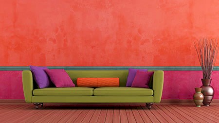
“Vivid Expression is a celebration of excess, with bright colours uniting in one story and reflecting a world of abundance. Decadent and high spirited, this theme reflects a global culture through a combination of hot, tropical hues and neutral organic shades. Our senses are heightened in this lively story where we get an instant rush of adrenaline, complemented by a colour overload that inspires large-scale designs. Surface decoration becomes indulgent and rich, with bold tones and playful application creating a joyful atmosphere.” Key influences: Sensory overload, colour clash, artistic style, mix and match design and playful application. Trends within this ‘group’ include vivid contrasts, painted features, brush marks and colour bleeds.
‘Tailor Made’
“Delighting in the everyday, Tailor Made explores a quiet luxury where simple design is valued for its honest and thoughtful approach. Familiar objects and everyday materials are combined with warm neutrals while evocative finishes like metallics, concrete and marble enhance the overall effect through tactility and depth.” Key influences: Comforting colour, familiar objects, hand crafted items, deluxe finishes, textured surfaces. Trends within this ‘group’ include deep colour, contrasting walls, outlined furniture, duo walls, painted wainscoting and curated collections.


