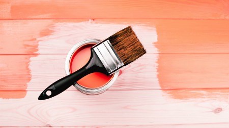
Described as emotionally nourishing, energising and playful, the 2019 PANTONE Colour of the year is Living Coral.
For the last 20 years, the creative community wait with bated breath for the Pantone Colour Institute to announce their colour trend for the year ahead. While choosing a colour trend might seem frivolous to some, the effect of this announcement affects multiple industries including décor, industrial and graphic design, fashion, beauty as well as packaging to name a few.
In order to make their choice each year, Pantone’s colour experts spend a vast amount of time searching far and wide in order to discover new colour inspiration, tapping into, “the entertainment industry, traveling art collections and new artists, fashion, all areas of design, popular travel destinations, as well as new lifestyles, play-styles, and socio-economic conditions”, according to their website.
So let’s get into their decision for 2019…
Described as emotionally nourishing, energising and playful, the 2019 PANTONE Colour of the year Living Coral promises “the comfort and familiarity that make us feel good.” Laurie Pressman, Pantone’s Vice President, also notes that, “with everything that’s going on today, we’re looking for those humanising qualities because we’re seeing online life dehumanising a lot of things. We want to play. We want to be uplifted.”
With that said, it’s hard to imagine why one wouldn’t want to introduce this pinky-orange hue with golden undertones into their home! Here’s how to go about incorporating this colour trend into your home…
MAKE A STATEMENT
Due to its exuberant and bold nature, Living Coral certainly demands attention! Create a dramatic focal point in your home by using it to create an accent wall in your lounge or bedroom for example. Alternatively, look for patterned wallpapers, like botanicals or tropical prints, or even tiles that include and visually celebrate this cheerful hue. If you’re looking for something a little less dramatic, then consider painting the ceiling or wall trimmings for a sense of warmth and invitation without the fuss. Living Coral also works best in rooms that get plenty of natural light so be sure to balance it out with neutral or white accents for that bright and airy feel.
ACCESSORISE
Whether it be a throw, rug or scatter cushion, Living Coral is sure to lend any home a warm, playful and comforting feel. You can even consider bringing it in with lamp shades, curtains, sheets or even scented candles – the sky is the limit! That said, Living Coral is a colour that calls for a hint of adventure so don’t be scared to consider a coral covered couch or give that dresser a new lease on life with a coat of paint. Make sure, however, to limit accessories to three items or less, to keep things balanced.
PAIR IT UP
As Living Coral is a colour that appears amidst an array of colour in nature, the pairing possibilities are truly endless, and one shouldn’t limit it to pairing with pastels as is the common misconception. In fact, The Pantone Color Institute references complementary colours that appear in natural phenomena such as sunsets (like Amberglow, Papaya and Radiant Yellow); skin tones (such as Sand, Candlelight Peach and Burnt Henna); as well as in the ocean (like Turtle Green, Limpet Shell and Turkish Sea). You can even go so far as pairing it with lots of indoor plants and wood tones to complete a bold, nature-inspired look.
It’s clear that Living Coral offers a hugely diverse range of décor possibilities that are sure to brighten and breathe life back into any living area or space. Given its ability to induce a sense of playfulness and joy, it’s definitely worth considering when re-decorating this year or purchasing some new décor accessories for your home.


