For many, selecting a wall colour can be a daunting, highly involved decision - with good reason. Colour choices are, in a way, an extension of ourselves and are typically judged as such which is why so many tend to go with ‘safe’, neutral colours. But is there really such a thing as a ‘wrong’ colour?
The colour wheel and the concept of harmony probably comes to mind at this juncture. Although useful in many respects, the ‘rules’ pertaining to colour aren’t set in stone says Plascon Spaces showroom colour consultant Neo Moshomane who explains that increasingly, home owners and decorators are ‘breaking the rules’ with great success.
Says Moshomane: “Although neutral palettes comprising grey, white, beige, chocolate brown, pastels and nude tones are still popular, we have seen a distinct shift towards bold, daring colour schemes which ‘break the mould’.
“For instance, we have seen a lot of acid green trickling into colour schemes of late. This colour has been successfully paired with deep browns, grey blues and other earthy colours which are typically painted on opposing walls. Some of the accent pieces which pair well with these colours include leather chairs, brightly coloured furniture and woven baskets.”
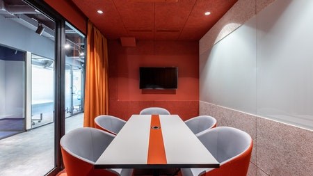
According to Moshomane “city colours” such as bright orange, yellow and green are also being used to great effect. Pink, yellow, turquoise and grey have also been effectively combined to create beautiful spaces she says.
‘Marsala’ – Pantone’s beautiful, rich 2015 Colour of the Year is also being paired with royal blue, forest green and mustard hues to create unique, intimate spaces says Moshomane. One of the more unusual colour combinations she’s seen of late comprised red, orange and pink which worked “surprisingly well.”
Notes Moshomane: “People are pushing the envelope when it comes to colour choices. They want to make a statement and show that they aren’t afraid to think out of the box. That said, while people are more willing to be experimental in their lounges and kitchens, they still tend to tone things down and stick to calmer, more neutral palettes in the bedroom which is understandable given that this is where people generally want to relax and unwind. Few people find strong colours such as red and acid green soothing come time to sleep.”
“In a nutshell, I’ve found that there is no ‘right’ or ‘wrong’ when it comes to colour. Of course certain colour schemes naturally work very well together but colour by its very nature is flexible and using colours that ‘clash’ can produce unexpectedly fantastic results.”
For those who do want some more ‘structure’ when choosing colours, the following tips may come in handy:
· Consider the light: Lighting plays an important role in choosing colours. While the right light can bring out the best in a colour, the wrong light can make it appear lurid or drab. Before committing to a colour, paint a sample and see how it looks at different times of the day as well as under artificial light. You might be surprised
· Too many colours: While there’s no ‘official’ limit as to how many colours you can use in a room, too many does tend to be distracting and unsettling. If you feel your room is going the rainbow route, eliminate a few colours until you start feeling more relaxed and balanced. Generally speaking one or two primary colours and a handful of secondary, accent colours works well
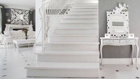
· Being too ‘safe’: The opposite of too much colour is too little. Rooms decked out entirely in monochromatic hues can sometimes come across as being too clinical. A brightly coloured feature wall or two and other pops of colour can make all the difference
· The wrong finish: The wrong finish can have a surprisingly big impact on the success of a colour. While some rooms work well with glossy colours, other rooms will work better with matte colours. Again, the best way to determine what works best is to first paint a sample before committing to a colour
· Too bright and bold: Although bright and bold colours have their place, they can sometimes be overwhelming and quite harsh. If you find this to be the case but still love the colour, don’t give up on it, rather just have it lightened to a less eye-watering hue or use the colour in accent pieces such as a chair or throw


