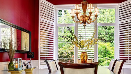
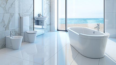
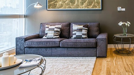
While the choice of colour for interiors may be an immensely personal thing, the contrasts and combinations of warm and cool palettes continue to inspire.
BLACK MAGIC
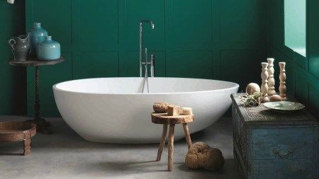
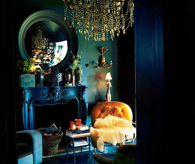
While we all love the freshness of an all-white canvas on which to layer colour, noir is so very now. Whether it’s dusky charcoal, dark green or deep mauve, an intense shade used as a starting point against which to inject bright pops of colour lends contemporary clout to any interior. UK designer Abigail Ahern’s new range of mainly natural-pigmented paints – which includes the likes of Hudson Black, Madison Grey and Mulberry Red – is designed with nuanced undertones that change subtly according to the light. Buy the paint online at abigailahern.com.
LAYER IT ON
Painting the envelope of a room (the walls, floor and ceiling) a single colour allows for the building of textural interest through layers of hue all chosen from the same pigment family. The owners of design-focused communications company, Bergdorf Agency (bergdorf.org), have done just this in the minimalist interiors of their 19th-century Swiss chalet. Contrasting tones of teal, green and lilac used in the guest bedroom exude an unexpected warmth and at once dispel conventional notions of what comfort looks like.
LOOKING BRIGHT
It’s all in the details when it comes to pulling a palette together. Even the smallest bright accents are able to lift a cool scheme into the realm beyond the pale. Giving new definition to the terms ‘handmade’ and ‘homespun’, Casamento’s Lucy Chair overlays blue leather and linen with eye-popping canary-yellow felt, all held together with exaggerated blanket-stitching in contrasting hues, for a modern take on craft cool (casamento.co.za).
MOODY BLUES
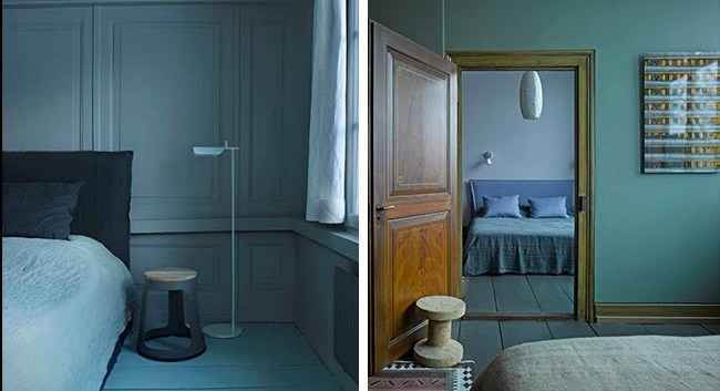
The last word in contemporary cool, this bedroom (from the same chalet pictured left) is steeped in texture thanks to the overlaying of tonally equal hues. According to Cape Town designer Etienne Hanekom, "Adding textured fabrics and small amounts of high-gloss or satin finishes lends a distinct moodiness thanks to the play of light on the different surfaces."
PATTERN PLAY
The layered look needn’t be reserved for painted surfaces. The interplay of prints and patterns – again, all from the same colour family – adds jaunty interest when displayed against a tonally graduated canvas. The Splayer Sofa from Casamento (casamento.co.za) employs alternate patterns and plains, embroidery and buttons to lend a fun element to an otherwise functional piece. Patchwork has never looked so good!
OFF THE WALL
Move beyond walls and extend your chosen palette to furnishings for an infinitely polished look. Accessories in acid-pop versions of your scheme’s holding colour create the illusion of depth and three-dimensionality, instantly alleviating the potential tedium of a monotone interior. In addition, the chemistry between various surface textures – be they grainy painted wood or glossy powder-coated steel – again offsets the risk of monotony. A case in point, the lumo-bright teal Burr coffee table is the result of a creative collaboration between Tonic Design (tonicdesign.co.za) and electric bicycle designers, Cycology (cycology.biz).
POWER TO PAPER
The writing’s on the wall when it comes to paper – ‘busy’, ‘bright’ and ‘bold’ are your buzzwords when taking the plunge. But stick to neutrals for furnishings and accessories or face potential pattern burnout. A mix of orange and umber tones displayed in a graphic diamond design, the new textured wallpaper by Casamance – called Dandy – has a fabulous mid-century appeal. Available at Hertex Fabrics (hertex.co.za).
BLUSHING PRIDE
Mix ’n’ match is the order of the day when it comes to colour – in the case of the Rosso server, a soft pastel- rose hue offsets the piece’s clean lines and modernist shape. Available from Tonic Design (tonicdesign.co.za) as part of the company’s capsule range created with Cycology (cycology.biz).
HOTTING UP
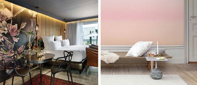
Splashes of fluorescent red- and rose-tinted glass contrast with light-sanded timber in this characterful sauna-cum-bathroom found at the 25 Zurich West Hotel, part of the 25 Hour Hotel group (25hours-hotels. com). Sassy tongue-in-cheek design is what it’s all about (consider that the hotel’s working slogan is ‘the smile of my hometown’), and this warm little node set high above the city and overlooking the snow-capped Alps is undoubtedly its guests’ happy place.
FINE PRINTS
Talented local artist Victoria Verbaan (victoriaverbaan.com) has recently put her hand to designing wallpaper, among other home fittings – and, boy, are we glad she did. This bright pink, white, orange and red print, which would look great as a feature panel, is called Leeuliefde and forms part of her House of Orange Collection. Being of Dutch origin, Victoria was inspired by the orange, pink and red tulips of her native Holland as well as the country’s national animal, the lion. Available from Robin Sprong Wall Paper (robinsprong.com).
COLOUR FESTIVAL

The lobby of the Generator Barcelona hotel – which is set in the hub of Barcelona’s Gracia district – is awash with hotter-than- hot brights, reflecting its location in what is arguably the most romantic of Spain’s cities. Taking its cue from Gracia’s sizzling- hot energy, the space features a vibrant mix of textures and patterns, including those of ornate Hungarian floor tiles, structural raw metal and wood, plus, of course, the over-the-top abundance of more than 300 floating lanterns – an artistic installation of sorts created by local artist Julie Plottier and inspired by Barcelona’s annual Festa Major de Gràcia (generatorhostels.com).
WONDER WALL
Inspired visually by nature and texturally by watercolour painting techniques, this pretty wallpaper, entitled Skymning, was designed by Karolina Kroon for Swedish textile and interiors company, Sandberg. Totally on trend, it’s the wall equivalent of fashion’s obsession with ombre. Available locally from the Silk & Cotton Company (silkco.co.za).
ASK THE EXPERT
Interior designer Etienne Hanekom, who recently completed the suite extensions of Majeka House, shares his dos and don’ts of hue…
DO start with a warm grey or khaki tone for your walls, then add accents of vibrant colour.
My current go-to colours are khaki, navy and mid-tone greys. These three colours complement most other colours and materials.
DON’T overdo it. Colour can be sophisticated and classic in its pure form, especially when balanced with warm metals and natural woods.
DO try using different shades of one primary hue, like yellow that runs to green on one side of the spectrum and ochre on the other.
DON’T make the mistake of thinking that colour has to be bright to make a statement. ‘Dirty’ colours – as opposed to light tones – are amazing when used en masse.
DO stick to complementary hues when colour mixing. My favourite palette right now is navy and grey with pops of acid yellow.
DON’T be afraid of the dark. Sombre- hued interiors have a life of their own, especially when there is an interplay of light and shadow at different times of the day.
DO mix and match textures in an all-white interior. Matte surfaces interspersed with high- gloss finishes create drama in a monotone scheme. This winter, for instance, I’m taking inspiration from a simple box of eggs – shades of whites that move through the spectrum of naturals from pale yellow to strong ochre. etiennehanekom.com
Layer a scheme by using different shades of the same hue. Grey can move into navy, ochre can move into khaki or even chocolate.
-Etienne Hanekom
